
Rain Should Reveal a Route
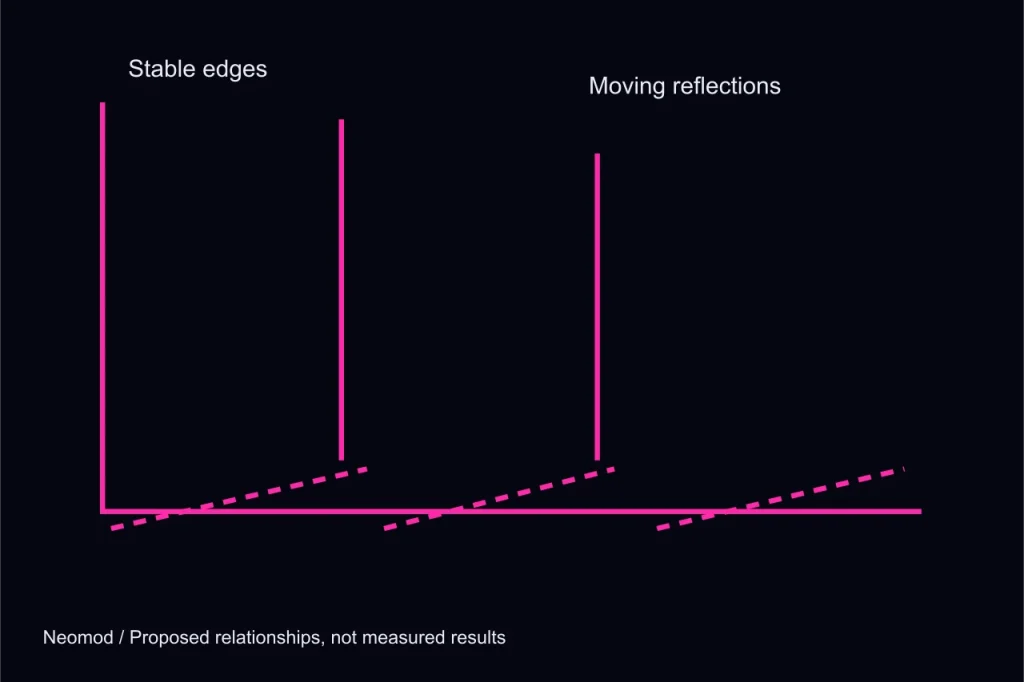
Observe: every surface competes
Rain, neon and reflective pavement can make a cyberpunk scene immediately recognisable. They can also make every edge look equally important. If a bright reflection resembles a doorway or a puddle hides a step, the player may misread the space for reasons unrelated to the intended decision. Neomod’s visual concepts use rain as a way to connect places and distinguish exposure, but the effect needs limits. This note considers how a route can remain legible while the city keeps its wet, saturated atmosphere.
Assign contrast to a relationship
A strong highlight should help explain something. A reflection beneath an overhead walkway can reveal its position to a runner at street level. A darker sheltered alcove can identify a place where the character can pause. A thin yellow interruption can draw attention to an occupied threshold. These uses differ from placing bright accents wherever the image feels empty. We would begin by identifying the route’s important relationships, then decide which of them deserves contrast at the moment the player is expected to act.
Propose: separate wetness from navigable edges
The pavement can carry broad reflections while the edges used for movement retain a stable shape. A curb may have a quieter material strip; a doorway may keep a consistent dark frame; a stair can show its risers without relying on a moving highlight. The goal is not to remove visual richness. It is to prevent a temporary lighting effect from being the only evidence of a permanent obstacle. A player should be able to recognise the same route when the viewpoint or rain intensity changes.
Give shelter a readable character
Shelter changes more than the amount of rain in front of the camera. It can reduce reflected movement, soften the soundscape and provide a less cluttered background for an interface. That makes a covered working position feel different from an exposed junction without adding a large safe-zone label. Shelter should not imply absolute safety unless the mechanics support that promise. A player can understand it as a place with different conditions rather than a magical boundary where every system stops noticing the character.
Keep signal colours from becoming decoration
The palette includes magenta, cyan and yellow, but their functional uses need restraint. If yellow marks every attractive sign in the scene, it cannot also reliably identify an important interruption. The interface and environment should agree on where a colour carries meaning and where it is merely part of the world. Shape, text and position must still support that meaning. This is especially important on a phone-sized screenshot or for a player who does not distinguish the palette in the same way as the artist.
Check stillness as well as motion
A reduced-motion presentation should retain the useful information in rain and signal changes. A static wet surface can preserve the relationship between a light source and its reflection. A clear state label can replace a repeated pulse. We would compare a moving scene, a still image and a grayscale version to identify information that disappears in only one presentation. Those comparisons are planned design checks, not completed performance or accessibility results. The concept should state what it intends to test instead of treating an attractive image as proof.
Return the image to the encounter
The final question is whether the visual treatment helps the player explain the route. In Rainsplice, the runner needs to recognise a working position and an exit while watching a connection. In Service Ghost, quieter service spaces need to communicate ordinary work and changing expectations. The same palette can support both without forcing them into identical compositions. Read the exit-first route study for the spatial decisions that should exist before reflections and rain are added to the scene.