
A Warning Needs an Address
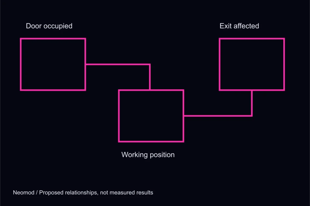
Observe: the alarm explains too little
Imagine a runner connected beside a service entrance. A red bar begins to fill, but the street looks unchanged and the network display offers no reason. The player knows that something is becoming dangerous without knowing which action might improve the situation. In the Rainsplice concept, this is the warning problem we want to avoid. A notification should identify a changed relationship. Urgency alone is not useful information, especially when the player is already dividing attention between a physical street and a fictional network view.
Name the source before the severity
An approaching maintenance crew, an expiring connection window and a blocked retreat are different problems. They should not become three indistinguishable increments in one threat total. A source label can connect a warning to a visible place or condition. The crew affects the working position; the window affects the available connection; the blockage affects departure. Even if several changes occur together, the player can prioritise them by understanding what each removes from the plan. The interface should help make that comparison rather than requiring the player to infer it from colour.
Propose: put the warning beside its consequence
The proposed display keeps a small route summary beside the current objective. If the service doorway becomes occupied, that doorway is marked in the street view and its role in the plan is named. If a network branch becomes unavailable, the affected objective is marked in the connection view. We would not flash the entire screen for either event. A local change should receive a local explanation first. More prominent treatment is reserved for a condition that makes continuing the current action impossible, not merely less convenient.
Preserve the last understood state
A player who switches views should not lose the warning they were trying to interpret. A short event record can state what changed and whether the condition remains active. This is not a scrolling log of every background operation. It is a small memory aid for decisions the player can actually make. The record should distinguish a current obstacle from a resolved interruption. Otherwise the player may spend attention on a warning that no longer matters, or assume that a disappearing message means the problem has been solved.
Give withdrawal a clear consequence
If a warning encourages departure, the interface should explain what the runner keeps by leaving now. A partial status record may already be saved, while a deeper branch remains unknown. That distinction makes withdrawal an informed choice. Without it, players may continue simply because they cannot tell whether stopping will erase all progress. The proposed design does not guarantee a safe outcome after every warning. It should, however, communicate the available decision before punishing the player for failing to make it.
Check: can the warning be described without its colour?
A useful review asks someone to explain the problem after seeing the interface in grayscale. If the answer is only that a red thing appeared, the warning lacks a readable source. Text, shape and position should carry the same core meaning as colour. Audio can reinforce the event but should not be its sole explanation. Reduced-motion presentation should retain the event’s priority without relying on repeated flashing. These are proposed evaluation questions, not a report of completed accessibility testing on a released game.
What this changes in the concept
The warning system becomes a small account of changing options rather than a judgement of how badly the player is doing. That fits the Rainsplice loop, where selecting an objective and retaining an exit belong to the same decision. The companion note on drawing the exit first considers the spatial half of that relationship. Both remain concept studies until a working encounter demonstrates that the player can understand a warning, choose a response and recognise its consequence.